Helper-responsive
Generate sequence of numbers automatically.
Create your responsive feature instantly using the v-helper valclass.
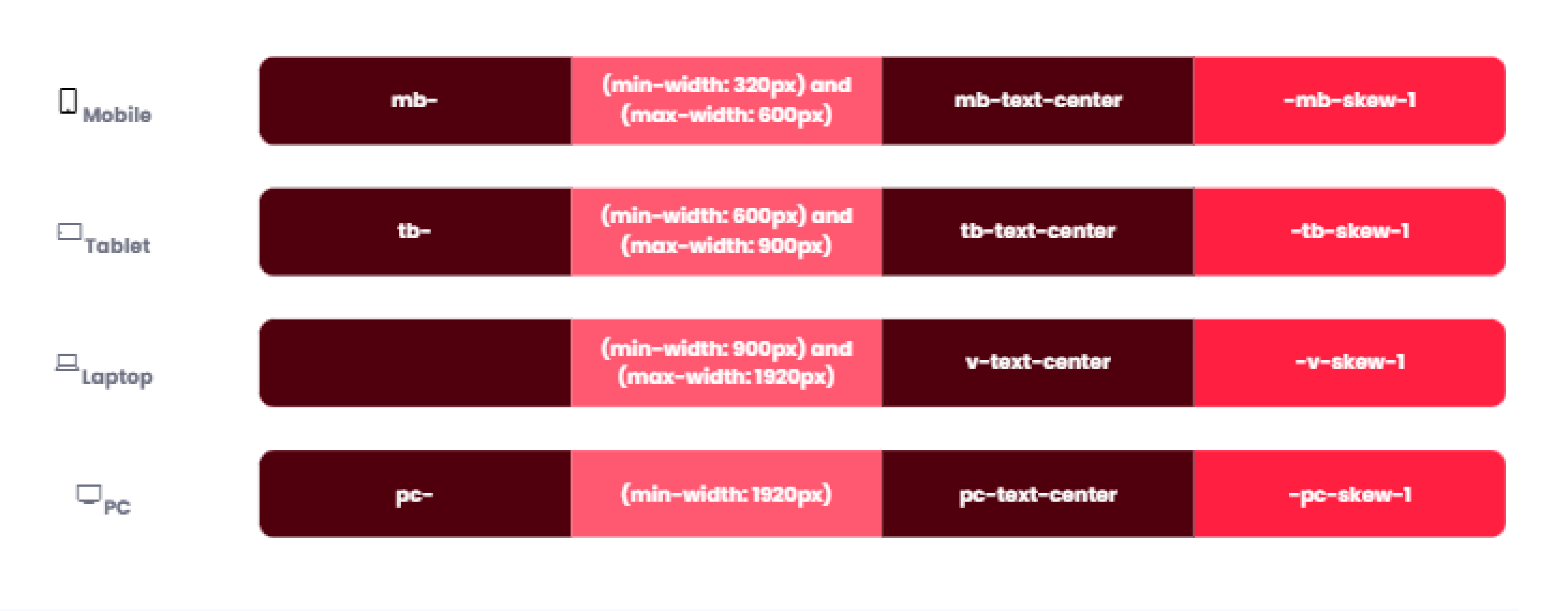
Table list sizes
| Class name | Type | Properties |
|---|---|---|
mb- | Mobile size | (min-width: 320px) and (max-width: 600px) |
tb- | Tablet size | (min-width: 600px) and (max-width: 900px) |
c- | Normal size | (min-width: 900px) and (max-width: 1920px) |
pc- | PC size | (min-width: 1920px) |
The table above presents several types of sizes with different variants.